Our Blog
6 Tips To Improve WordPress Website UX With Analytics

User experience (UX) is a key aspect which governs your website’s performance. Google does not confirm or deny whether it uses UX as a ranking signal. However, it is known to be a fact that key elements like page loading speed are used for determining SERP positions. It, therefore, becomes essential to make sure that visitors enjoy their time on your interface and find it useful. Are you aware that you can improve WordPress website UX with analytics tools? These solutions provide an in-depth view of visitors’ behavior by presenting quantitative data. This insight can be used to make informed decisions to redefine your approach. Let’s see how you can use services like Google Analytics, Hotjar, and others to discover how people are using your website.
1. Monitoring Your Key User Journeys
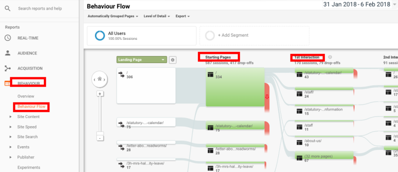
When a visitor arrives on a page of your interface and then visits its other sections, it is called user journey. Tracking the path taken by users can help identify key issues in navigation and design. In Google Analytics, you can monitor visitors’ journeys in the Behavior Flow section. Take a look at the image given below.
It shows all the points from where people enter your interface in the Starting Pages column. Then it moves to the 1st interaction section which displays what they did next after accessing the entry point. This can unearth critical issues like pogo sticking in which visitors keep bouncing between two pages of a website. In case you find people are not reaching your main conversion pages, then it is time to replan the layout of previous pages in the journey.
2. Finding Out Where People Leave Your Website
It is inevitable that people will leave a website eventually. However, it is necessary to know the point from where they are exiting the interface. You can use the Exit Page View in Google Analytics to monitor the metric.
In case, they are leaving after visiting your key conversion pages like subscription form or checkout page, then your strategies seem to be working fine. If a website owner spots that people are leaving after viewing the homepage, then there is surely some problems with the layout. There can be various reasons for such exits. It can be because the navigational plan is unclear to people. They may also be leaving early because they do not find the content engaging enough. You can check the clicking pattern to know whether the navigation links are being clicked or not. This will help you know the root cause of the problem.
3. Tracking Key Events
Another analytics feature which can help you improve WordPress website UX is event tracking. Events, in this case, are interactions that people have with the website content. You can get exact data about link clicks, form submissions, downloads, etc. For instance, if the call to action button on your landing page is being hit by visitors regularly, then your page is working fine. A poor clicking statistic will indicate that there are some issues with the page that is discouraging the visitors from converting. You can dive in deeper by checking whether people visiting the contact form page and then not completing the desired action. This will show that there may be problems with the form. If people are not clicking the link to the page, then it can be the content which may not be compelling enough.
4. Monitor Search Usage
People who own content-intensive or e-commerce websites must monitor the search usage on their interfaces. A search bar is a mandatory feature on websites which have lost of pages. It makes it easy for visitors to find the desired items and ensures a good user experience. High traffic on the search action along with a high bounce rate and low average engagement will indicate a problem. The user journey before and after the search action need to be studied to identify the cause behind the issue. In case, most searches are related to pages which are listed in the navigation bar, then you need to replan your navigation menu.
5. Using Heatmaps To Identify Areas Which Need Improvement
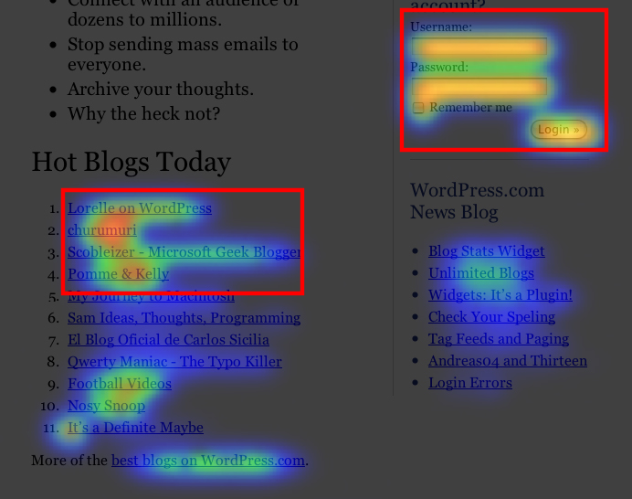
A lot of people migrate from other platforms like Drupal to WordPress. They might be unaware that apart from Google’s tool they can also use a range of other analytics services. These solutions come with some convenient display features like heatmaps. This creates a better visual representation of the data and shows you the exact locations which are not seeing much activity.
In the above image, you can see that a lot of people are signing in to read the blogs. The visual representation also helps in understanding the kind of content being read the most. This strategy can be used to measure the performance of key sections like landing pages and contact forms. You can use heatmaps to identify all areas which are not seeing much interactions and need improvement.
6. Use A/B Testing To Identify The Best Strategy
Once you have identified the reasons which are causing the UX issues, it is time to make changes. Some pages and sections will need to be redesigned. How do you know that the new approach will resonate with your audience? Many times, even though the intent is right, an incorrect application stops people from achieving their objective. The best way is to use A/B testing. For example, when remodeling a landing page, you can build two versions and launch them. Then use analytics to see which one is performing better.
Conclusion
Analytics provide vital insight into all the different aspects of your website. However, interpreting the data generated by the tools can be a time-consuming task. You can hire WordPress outsourcing services to do the tracking and suggest improvements.


