Our Blog
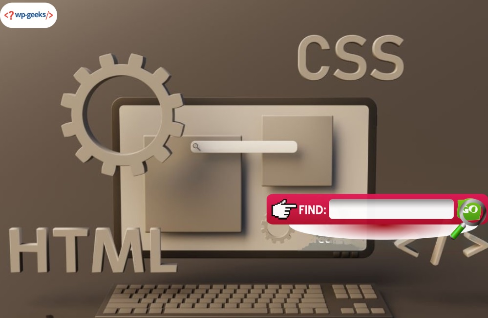
How to Build a Responsive Navigation Bar Using HTML and CSS
If you wish to add a responsive navigation bar on your existing website or build one from scratch then you are at the right place. A Navigation bar is an important aspect of a webpage that allows users to easily access the various features and functions. Here you will learn about the coding aspect and the different elements of Html to Responsive WordPress. These will help you understand the core aspect of having a visually appealing and responsive navigation function.
Why is a navigation bar necessary?
A navigation bar is an indispensable element of a webpage as it allows the users to search for necessary functions. Without a navigation bar visitors to a website will not be able to relevant functions for their purpose. There are different pages on a website with different content but one will not find everything that is essential without a nav bar. Another crucial factor is to make certain that a user spends sufficient time on the website and browses through the menu.
Navigation Bar Example
If you visit a certain website you will observe the nav bar is present at the top. You will also find that all product pages come with individual nav bars. Besides, there is relevant content to further enhance the journey of the users.
The most common categories present in a navigation bar include the following.
- About Us
- Products
- Contact
- FAQ
Working with HTML
First, let us understand the HTML structure of a responsive navigation bar. Convert Html to WordPress allows the creation of a simple navigation bar containing a logo and menu icon suitable for mobile devices.
Following is a clear breakdown of the HTML structure.
Nav element defines the container present in the navigation bar
Inside the nav element is an anchor tag containing the ID logo that serves as the title of the site or brand logo.
In the next step, you will add the type “checkbox” and id “hamburger” which is necessary to toggle the visibility of navigation links depending on the device.
Label element is necessary for the checkbox input with the for. It has an icon from the font library for representation of the hamburger menu.
In the last step, you will have an unordered list (<ul>) containing individual list items (<li>). This provides a representation of different navigation links.
Working with CSS
Let us take a look at the CSS styles necessary for the HTML structure. These styles define the appearance and behavior of a responsive navigation bar.
First, define the font family and color for navigation using the nav
The hamburger menu remains hidden using a label
An unordered list (<ul>) contains a style for removing default list styles and horizontally displaying list items with sufficient spaces.
With a navigation link alterations to the background color and border indicate an active link.
Media queries are essential for the application of background color and border. It indicates an active link in the navigation section.
You can use navigation queries for the application of responsive styles. As the screen width becomes less or equal to 600 px. The hamburger menu comes up and hides navigation links. A click on the hamburger menu displays all navigation links in a vertical order with a smooth transition.

Prerequisites for Creating a Responsive Navigation Bar
As a website owner, you are always searching for effective ways to acquire new visitors. The first step in the process is showing visitors a clear and easily accessible path. You can consider building a nav bar that helps inspire curiosity and attracts visitors simultaneously. Following are some of the important considerations to migrate html site to wordpress.
Simple
The nav bar should be visible and easy to read. In place of clustering nav bar with links you must include broad categories for the website. Next, you can consider adding sub-menus as dropdowns when necessary. The content of a website largely depends on its type. The navigation menu is similar to a road marker that directs visitors in the right direction.
So after establishing website content, one can decide how they wish to design the nav bar. There is no one-size-fits-all solution. Everything in Convert Html to WordPress is based on the placement of features and content on the website. However, it is best to avoid being too creative with the nav bar. The titles and categories should be easy and simple to read.
Responsive
According to global reports over 59% of the population are now active users of the internet. Out of which over 95% of people use mobile devices for the same. This should give a clear idea of the significance of converting Html to Responsive WordPress for a website.
The hypertext of content and website hypertext should have a clear distinction. A user should be aware of the differences between actual text and hypertext.
Do not forget the footer of the website. It is a place where one can add additional info that is not present in the navigation menu. The footer is essentially a place where you can choose to repeat information. For example, once the user reaches the end of a page they can click on the “next item” present in the footer.
Attractive
A responsive and simple navigation bar should not be boring. Use your pre-decided brand color to make the design aesthetic and consistent at the same time. It is always a good idea to try out different colors to highlight certain sections of the menu. Some of the popular ways of making a website more responsive include using floating icons, hamburger menus, guillotine, and tabs. It becomes a savior when there are several categories with multiple hierarchies.
Final words
Now you know about the different methods of creating a responsive navigation bar with the help of HTML and CSS. The above section discusses CSS styles, HTML structure, important considerations, and more. The navigation should adapt seamlessly to different screen sizes and offer an intuitive user experience across all devices. This article should give you a clear understanding of how to turn Html to Responsive WordPress. You can always make changes to the code and customize the nav bar to go perfectly migrate html site to wordpress.